
PEAKCARSENTIALS — Dark Premium Shopify Store
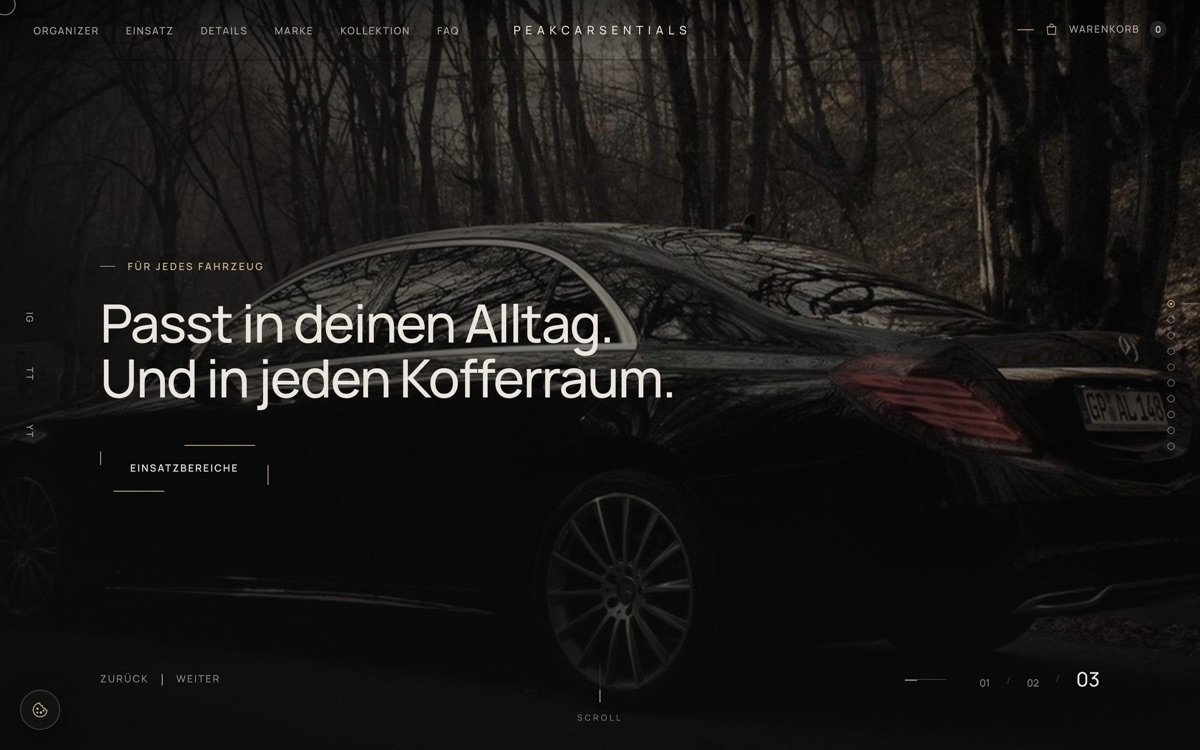
A German D2C brand launching a single flagship product: a premium car trunk organizer. The brief asked for a calm, high-end shopping experience that would stand apart from the loud, pop-up-heavy sites of its competitors — and an online shop that could grow from one product to many without a rebuild.
I designed and built it end to end: concept, UI, front-end, Shopify theme, performance work and GDPR-compliant consent.
At a glance
| Client | PEAKCARSENTIALS — premium automotive lifestyle brand (Germany) |
| Scope | Concept, UI design, front-end development, Shopify Online Store 2.0 theme |
| Role | Solo — design, build, testing, deployment |
| Stack | HTML, CSS, vanilla JavaScript (no framework), Shopify Liquid, Playwright, Python build scripts |
| Deliverables | 7-page storefront, 12 editable theme sections, 6 page templates, offline client preview |
| Language | German (informal "du"), built for multi-language expansion |
The brief
The client's kickoff questionnaire set a clear direction:
- "Dark Premium Automotive Lifestyle" — deep black, dark greys, a warm champagne accent used sparingly, warm off-white text instead of pure white.
- Calm, not salesy. The client explicitly disliked a direct competitor's site: pop-ups, visual clutter, an untrustworthy feel.
- Product-first. One flagship product, presented like a design object rather than a utility item.
- Extensible shop. New products must be addable without touching code — called out as non-negotiable.
- German only at launch, with the architecture ready for more languages.
- Needed: SEO, newsletter, Analytics, Meta Pixel. Not needed: blog, chatbot, booking tool.
Process
1. Interaction study
The client referenced a premium theme demo whose mood they liked. I analysed it with scripted browser automation — capturing every section at desktop and mobile widths and extracting its type scale, spacing and colour values — to understand the interaction patterns behind the feel: full-screen section snapping, offset corner-frame buttons, vertical labels, a slider counter.
Everything that followed is original code and original copy. No markup, styles, scripts or assets were taken from the reference.
2. Design system
A small, strict system did most of the work:
| Token | Value |
|---|---|
| Background | #0b0b0b deep black, #121211 anthracite surfaces |
| Text | #ece7df warm off-white |
| Accent | #c9b48f champagne, used only for lines, numbers and one primary button |
| Type | Manrope 300–600, self-hosted |
| Motion | One easing curve, staggered reveals, nothing bouncing |
Signature details: a button whose offset corner lines close into a full frame on hover, film-grain texture over the whole page, a custom cursor ring, and a slim section counter — restrained enough that the product stays the loudest element on screen.
3. Content architecture
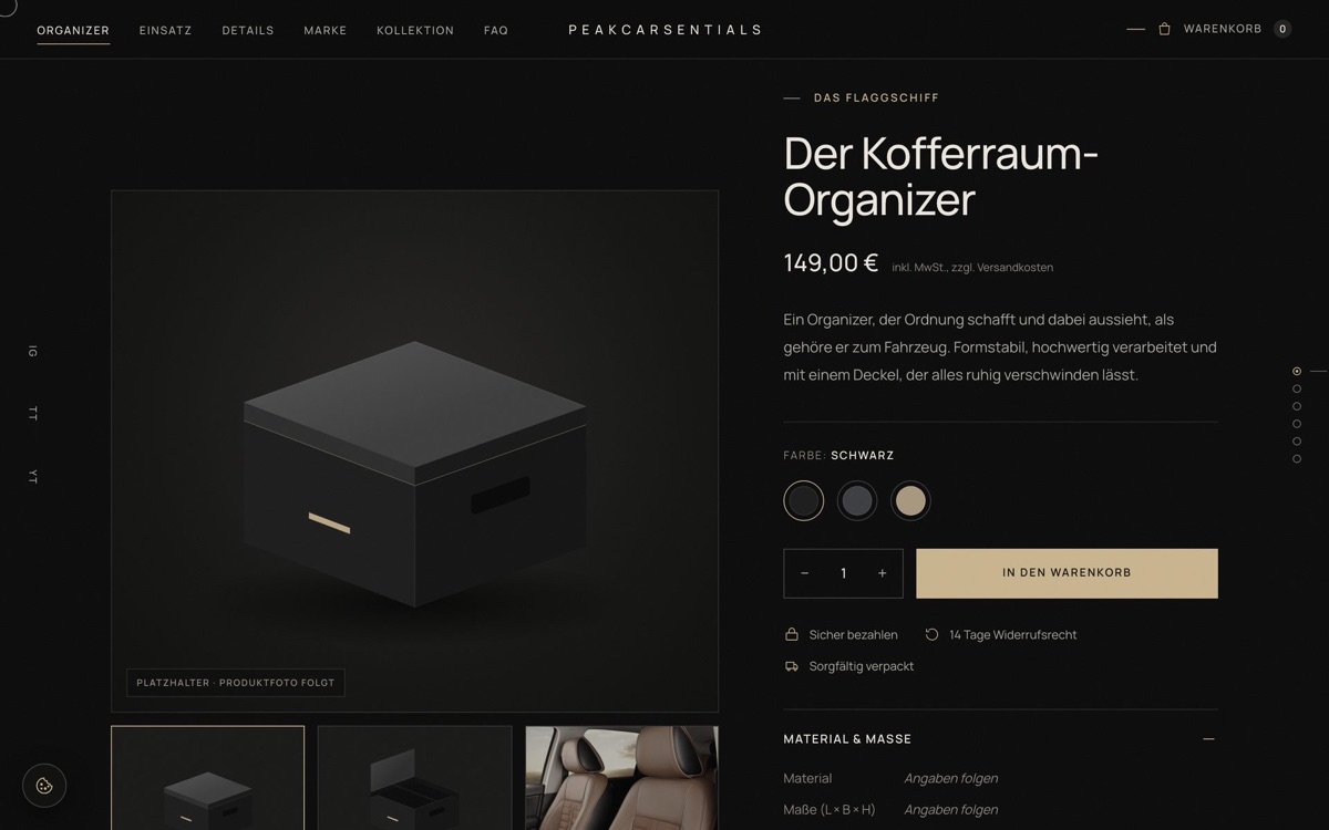
The homepage works as a guided sequence of ten full-screen sections: hero slider → benefits → product → use cases → construction details → brand → comparison → collection → FAQ → contact. Each menu item then has its own deeper page, so the site works both for a quick scroll and for a visitor who wants to read.
| Page | Purpose |
|---|---|
| Organizer | Product page: gallery, colour variants, cart, specs, FAQ |
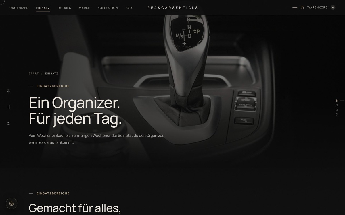
| Einsatz | Four everyday scenarios in detail — shopping, road trip, travel, daily use |
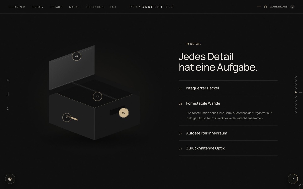
| Details | Interactive hotspots on the product, construction grid, comparison table |
| Marke | Brand story and the three principles behind the product |
| Kollektion | Filterable collection slider plus product grid |
| FAQ | Ten questions, contact details, newsletter |
4. Shopify theme
Converted into an Online Store 2.0 theme so the client can run the shop without a developer:
- 12 sections, every heading, paragraph, image, icon and link editable in the theme editor, each pre-filled with the launch copy.
- Repeatable blocks for slides, benefits, use cases, hotspots, comparison rows, FAQ entries and contact details — add, remove, reorder by drag.
- Real store data: product, variants, prices, cart and checkout come from Shopify. Colour variants automatically become swatches; the collection slider builds its filters from the products themselves.
- 6 templates (product, collection, 4 content pages) plus cart, search, 404, blog, account and password pages in the same dark style.
- German language file so another language is a copy of one file.
- Passes Shopify's
theme checkwith zero errors.
Engineering highlights
Section snapping that survives a busy main thread
The first implementation animated each snap with JavaScript on every frame. On a real store — where Shopify's own scripts share the main thread — that produced visible stutter: frames up to 133 ms, average 50 fps under a 4× CPU slowdown.
The fix was to hand the animation to the browser: native CSS scroll snapping, which runs on the compositor thread. Chrome, however, returns to the current section when a wheel step is smaller than half a screen — a mouse user would feel stuck. So a ~30-line handler decides direction once per gesture and lets the browser do the scrolling. Sections taller than the screen scroll through their content first, then snap onward.
Verified in both Chromium and WebKit, in both directions, including trackpad momentum.
Performance
Measured locally on a simulated fast-4G connection with a 4× CPU slowdown, before and after a dedicated optimisation pass:
| Metric | Before | After |
|---|---|---|
| Content visible | 2.9 s | 0.4–0.7 s |
| Largest image painted | 2.4 s | 1.1–1.7 s |
| Page weight on load | 1.3 MB | 370 KB |
| Images loaded up front | 9 | 3 |
| Worst style recalculation during scroll | 14–24 ms | 2.4 ms |
| Worst hover-event frame | 18 ms | 4 ms |
What produced it: dropping the loading screen; recompressing images with the colour treatment baked into the files instead of CSS filters; lazy-loading section backgrounds and later hero slides; self-hosting the font; replacing a blurred header and an animated full-screen grain layer with cheaper equivalents; and removing every scroll listener in favour of IntersectionObserver sentinels.
GDPR-compliant consent
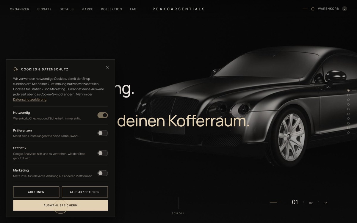
German law requires opt-in before analytics or marketing cookies. The banner offers Accept, Reject and Customise with equal visual weight for accept and reject — no dark patterns — plus four toggle categories, a close button, and a floating cookie icon to reopen it at any time. Google Analytics and the Meta Pixel load only after consent, the choice is forwarded to Shopify's Customer Privacy API, and withdrawing consent reloads the page so already-loaded scripts are gone.
Cart
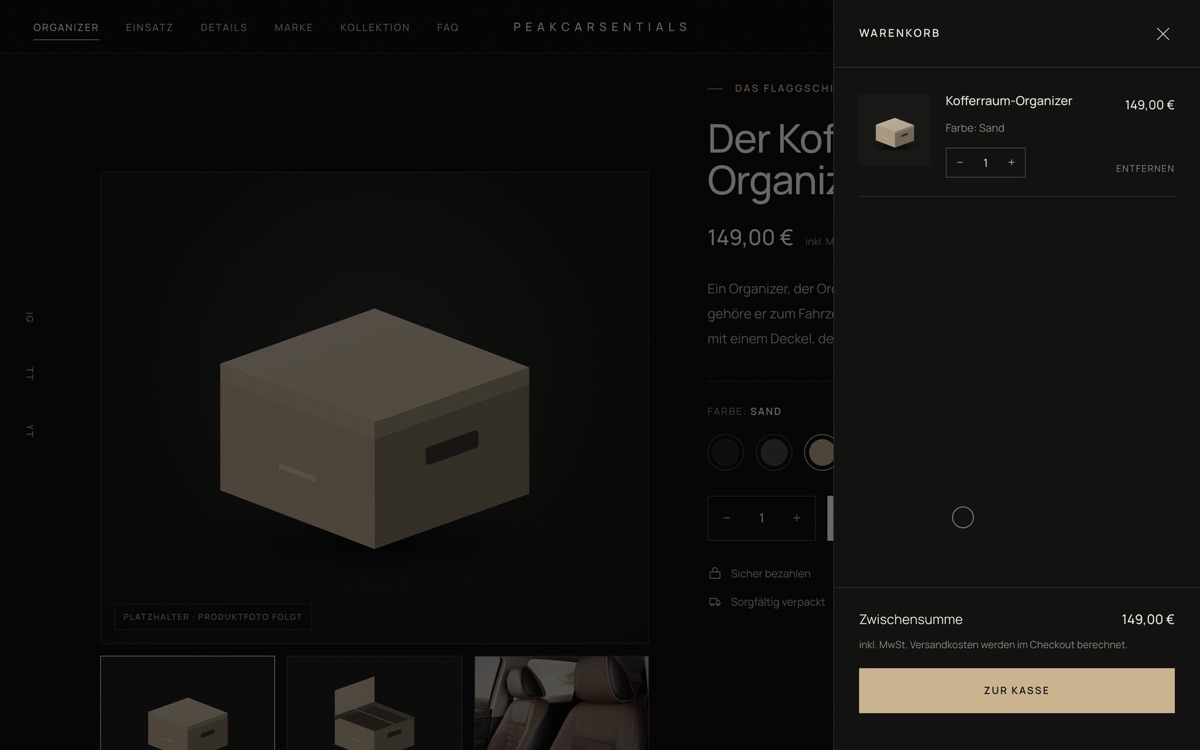
A slide-in drawer wired to Shopify's AJAX cart: add, change quantity, remove, live subtotal, and checkout. Error states (sold out, request failed) surface inline instead of silently failing.
Accessibility and robustness
- Keyboard-operable throughout, with visible focus rings and a skip link.
prefers-reduced-motiondisables animated scrolling and reveals.- Correct landmarks, ARIA labels and breadcrumbs; the cookie dialog manages focus and closes on Escape.
- The page still reads correctly with JavaScript blocked — which matters in practice: phone preview modes in WhatsApp, Mail and Files run no scripts.
Testing
Every change was verified with scripted browser automation rather than by eye: screenshots of each section at three widths, console-error checks, horizontal-overflow checks, frame-rate measurements, performance traces, and functional runs through variant selection, cart, filters, consent flows and forms — in both Chromium and WebKit.
Mobile
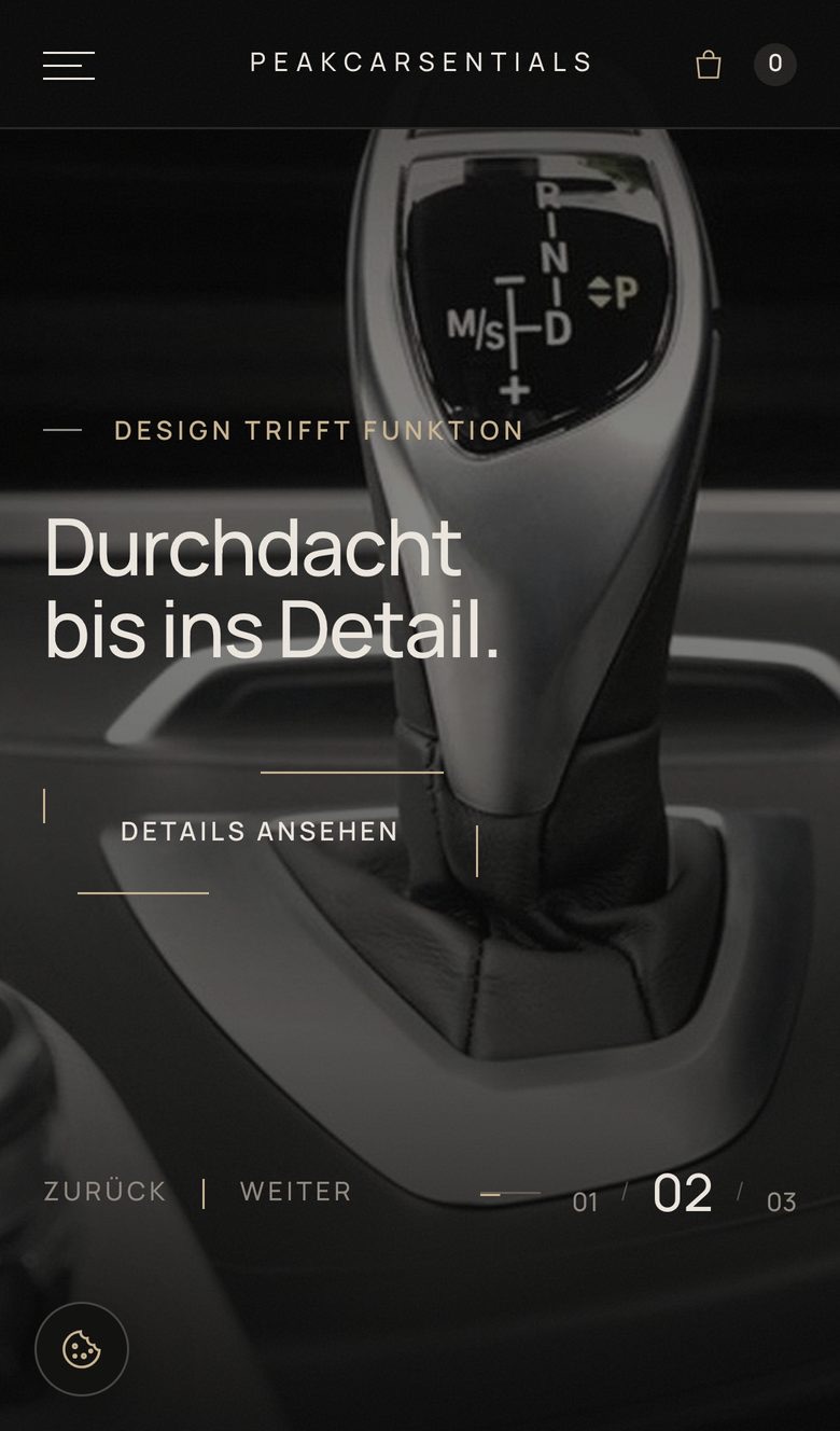
The full-screen snapping is desktop-only; on phones the sections stack and scroll normally. Carousels become swipeable, the comparison table turns into stacked cards instead of scrolling sideways, and the menu becomes a full-width overlay.
Result
- A complete storefront in the client's brand language: 7 pages, 12 editable sections, real Shopify commerce.
- Loads in well under a second on a mid-range connection, at 370 KB.
- Content fully editable by the client, extensible to new products without code.
- A self-contained offline preview (one HTML file per page, images and fonts inlined) for client review without hosting.
Status: the theme is live on the client's store as an unpublished theme, pending final assets — logo, product photography, confirmed price and dimensions. Until then the product is represented by line-art placeholders I drew, clearly labelled as such, and the photography is openly licensed stock standing in for the client's own shoot.